Art Direction Problem involves displaying different images for different screen sizes focussing on the important part of the image rather than just changing the resolution of the image.
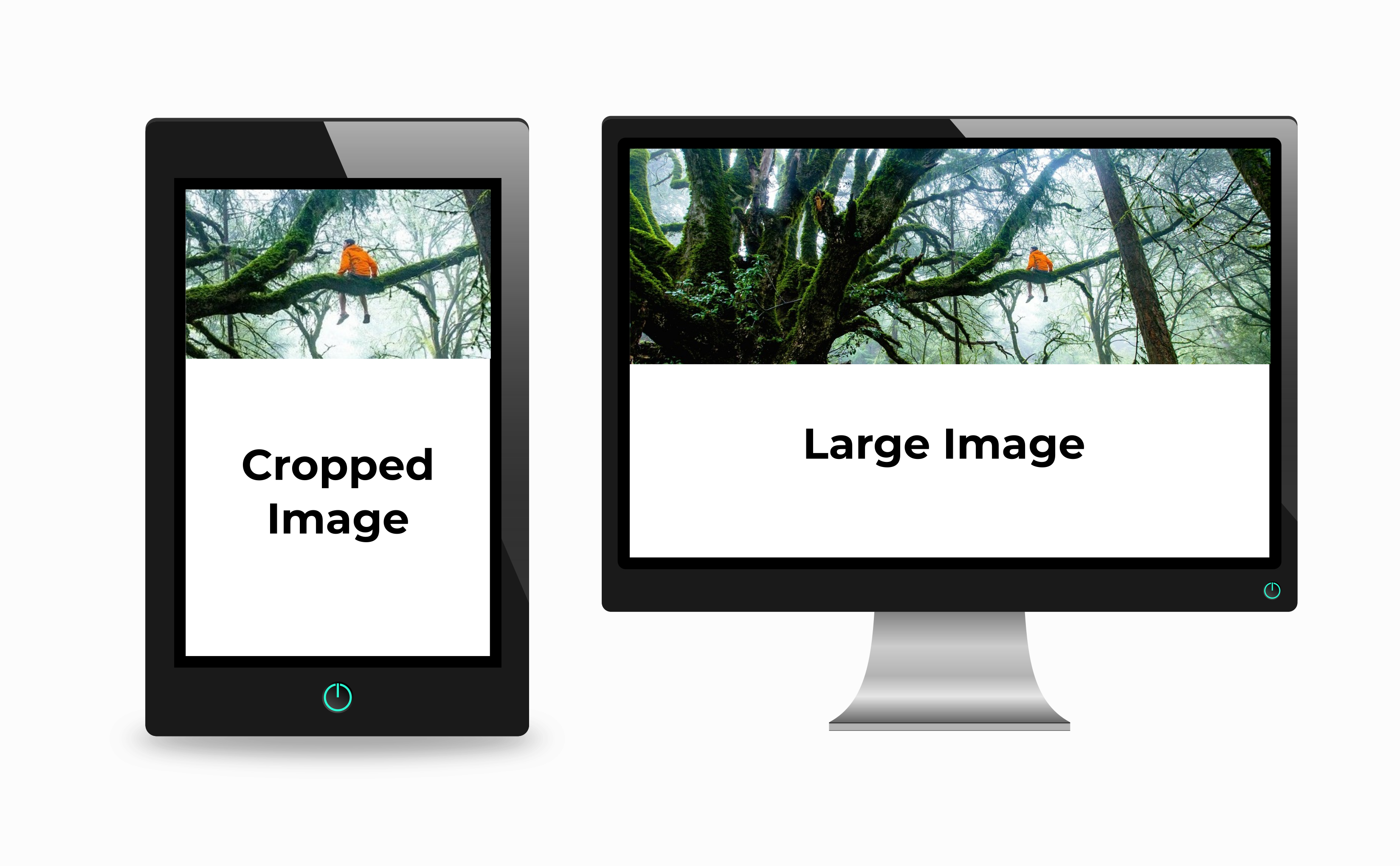
For example, in the above image, the person sitting on the tree will be clearly visible on a wider screen (desktop or laptop) but for a small screen like mobile or tablet, it will be better to have a cropped version to clearly showcase the image.
Solution
We will use the <picture> tag to handle the art of direction problem.
<picture> tag
<picture> tag is a wrapper tag which contains <source> elements. <source> elements provide sources for different images for different screen sizes. At last, we write <img> tag which is used as default.
<picture>
  <source media="(max-width: 799px)" srcset="img_cropped.png">
  <source media="(min-width: 800px)" srcset="img.png">
  <img src="img.png"
       alt="man on a tree"
  />
</picture>
-
media attribute: media attribute consists of media conditions according to which browser decides which image to show
-
srcset attribute: srcset attribute contain the path to the image to display.